![]()
I love drones, but I don’t love the stereotypes, stigmas, attention, and negativity that comes with them. I’ve been flying since the Phantom 4, so I got into it right as the wild west of drone flying was coming to an end, and restrictions and regulations were being rolled out.
Now several years after that, the general public perception of drones, the way they draw attention to me no matter where I am, and the challenge of even finding a legal place to send my drone into the air have soured my affection for them.
But I still love drones.
While the challenges associated with flying have certainly increased over the years, the technology of drones has also gotten really amazing. DJI’s last few drones, specifically the Mavic line, have really impressed me. When I reviewed the Mavic 2 Pro, I said that I believed drone photography was peaking, and while I haven’t used the original Mavic Air, my time with the Mavic Air 2 hasn’t changed that opinion: the Pro is still the pinnacle of aerial image making for most photographers, but the Air 2 does do a good job positioning itself between the Pro and the original Air.
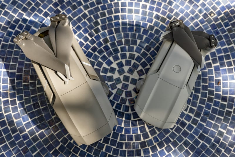
As a note, since I haven’t used the Mavic Air, my opinions of the Air 2 are juxtaposed with my experiences with the Mavic 2 Pro. Since the Air 2 is a more consumer-focused drone than the Pro (and a lot less expensive), I will often make note of where the Air 2 doesn’t stack up to its more expensive counterpart. I do think, however, that it is likely a more appealing offering to anyone who was interested in the original Air and does offer reasons to upgrade from that model.
Design, Build and Ease of Use
Just about every drone DJI produces is marketed as the smartest and easiest-to-use drone yet, and I can’t argue with them on these points, but I don’t know how much easier flying a drone could possibly be. Putting the Mavic 2 Pro in the air is a piece of cake, and that is no different with the Air 2. The entire package goes from being bundled in a small bag to flying in under 3 minutes, and that’s me going slowly and taking my time. I think DJI really nailed the user interface from this perspective with the original Mavic and that legacy keeps getting lightly fine-tuned with each new iteration. At this point, if it’s easier to use than the Pro, then it’s not by much. It’s already so easy, that with this model and future ones we’re really looking at diminishing returns.
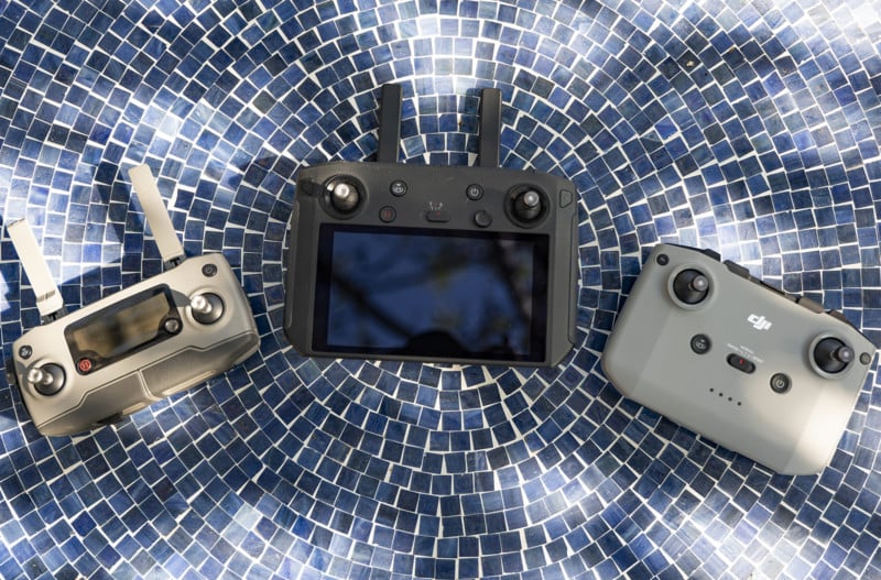
I think the biggest design change that I wasn’t expecting was with the Air 2’s controller. DJI actually did really redesign it, and I like it a lot more than I thought I would. The Pro 2 controller is smaller, but that doesn’t always mean better. It’s kind of awkward to unfold, it holds the cell phone that is used as a monitor weird, and it’s not terribly comfortable to hold. DJI did release a controller with a built-in monitor, but that one has the opposite problem of being too big and unwieldily. I also just prefer using my phone, as that interface feels much faster to get going than the Android-based system they have baked into their all-in-one controller.
The Air 2 controller feels like the best combination of those other two, being the perfect size for the average hands without being too big to comfortably carry around. DJI nixed the antenna on this new controller and redesigned the phone cradle. I think the cradle is almost there in terms of being perfect. It’s my favorite one they’ve made so far, but I do think it should have a push-to-lock-and-unlock functionality rather than having to awkwardly pull up on it when it’s fully depressed.
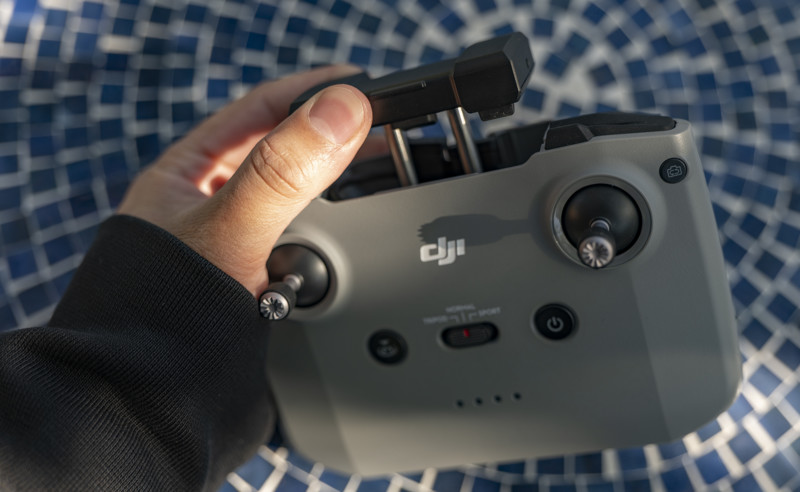
Losing the antenna feels like it came at a cost, though. When flying, I didn’t have any issues with pure range when I was flying without any obstacles in between me and the drone, but I did notice that if anything came between the controller and the drone, it could immediately lose signal. For example, there is a chest-high concrete wall around where I was flying the drone one morning, and just holding the controller at waist height behind that wall while it was running a move caused the signal to drop out and the move to be canceled.
The next day, I initiated yet another move and set the controller down next to me on the ground (I was seated) behind the small shoulder bag that comes with the Fly More bundle. Just being behind that little shoulder bag caused the signal to dip out, though this time it didn’t cancel the move as I pulled it up from behind the little bag fast enough for the reconnect to take place.
So while I like the design of the controller without antenna sticking out, that design choice may have come at the cost of excellent connectivity and is something to keep in mind when flying.
Let’s Talk Image Quality
Perhaps the biggest draw of the Mavic Air 2 is its 48-megapixel quad-Bayer 1/2 inch sensor mounted behind a 24mm f/2.8 lens. That is easily the highest megapixel non-interchangeable drone camera we’ve seen yet, even outclassing the Mavic 2 Pro’s 20-megapixel sensor (by the way, the implementation of that sensor on that drone I absolutely love).
Outclassing… on paper. In practice, the actual results with the Air 2 definitely feel more consumer-end in quality than what you get out of the Pro – which makes sense of course.
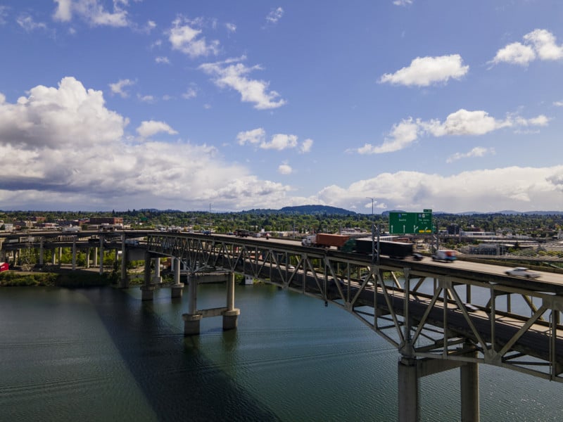
Do you know how cell phone photos have a “look” to them? Even when you do Portrait mode on the iPhone or high-resolution modes on some Android devices, when you actually zoom in to 100% or try to inspect details, the way that individual pixels are rendered will show less actual detail than you think you’re getting when you view it zoomed out on a cell phone screen.
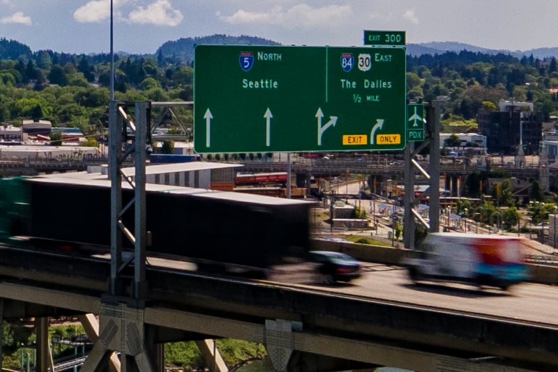
I think that’s a fair assessment of the Air 2’s image quality. At 48 megapixels the images are big, but they lack fine detail quality. This makes sense, as the 1/2 inch sensor is barely larger than most cell phone sensors and the idea of cramming more pixels into a small sensor sounds plausible, but it doesn’t match the quality of a normal 1-inch sensor. Pixel-binning four pixels into one does not one large pixel make, despite what some might try and say to convince you otherwise.
Even at ISO 100, if you zoom in at all to either the 12 megapixel or 48 megapixel just a little, you’re going to see noise. It’s not bad to the point it ruins a photo, but if you’re looking for it you’re going to see it. I think most people are going to be satisfied with the ISO performance up to ISO 800, but there and beyond things start to break down. The below images are JPEGS taken in 12-megapixel mode, straight out of camera.
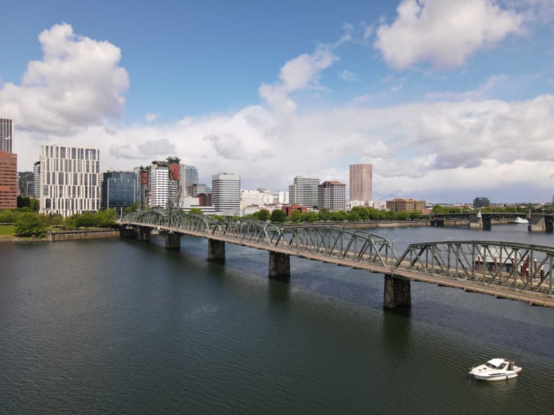
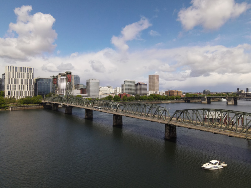
At ISO 800, the details start to get “crunchy” and the number of visible noise dots becomes more noticeable, even zoomed out.
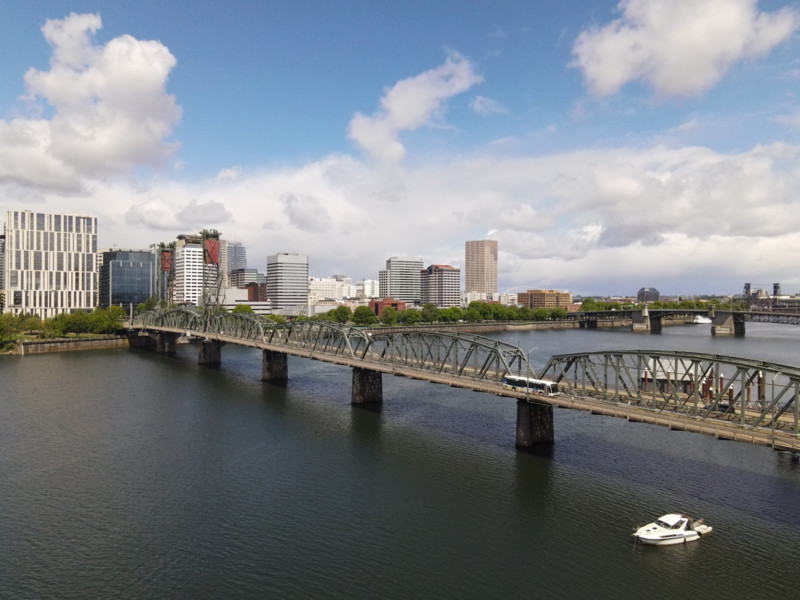
At ISO 3200 you’re going to start seeing some false colors introduced, and I would categorize images as completely unusable at the max ISO of 6400.
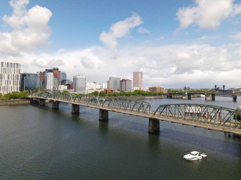
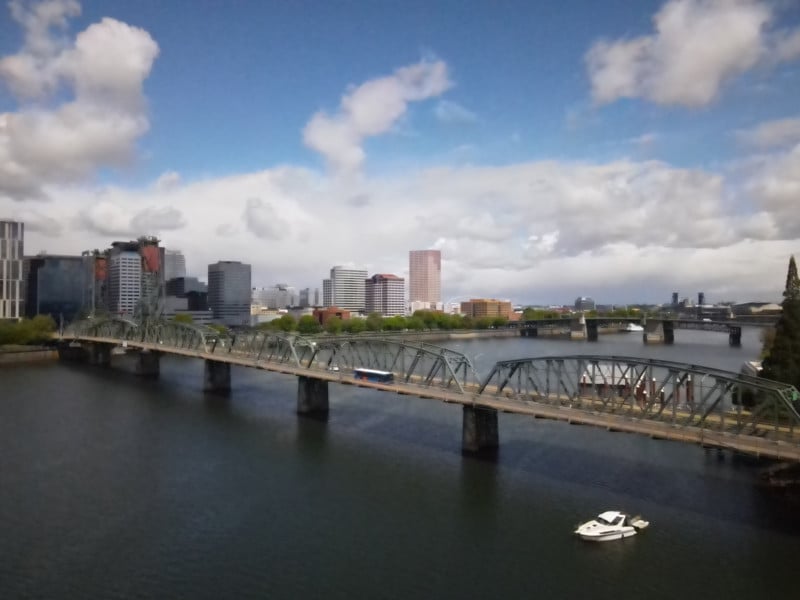
As a note, due to time constraints, these images were taken with an ND filter to show ISO noise. At night, expect more false colors to appear in the shadows at higher ISOs as the sensor struggles to work in low light. This camera is very clearly designed for bright daytime use, and that’s ok for the target market of the general consumer.
If you’re shooting in the 48-megapixel mode, your max ISO is 3200, while the normal 12-megapixel mode can go up to that aforementioned 6400. I am also happy to report that image quality does not seem to change at all between the two modes. Photo quality looks identical, for the most part, between them. The 48-megapixel mode just feels like it blows up the 12-megapixel photos, but does so with no loss in quality. The idea of this technology is outstanding, and I really hope we see it with larger sensors that can give us overall better image reproduction in the future.
I said photos look identical “for the most part” because I did have an experience where the 12-megapixel mode rendered colors wildly different than the 48-megapixel mode with the same scene and the same settings.
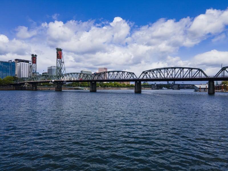
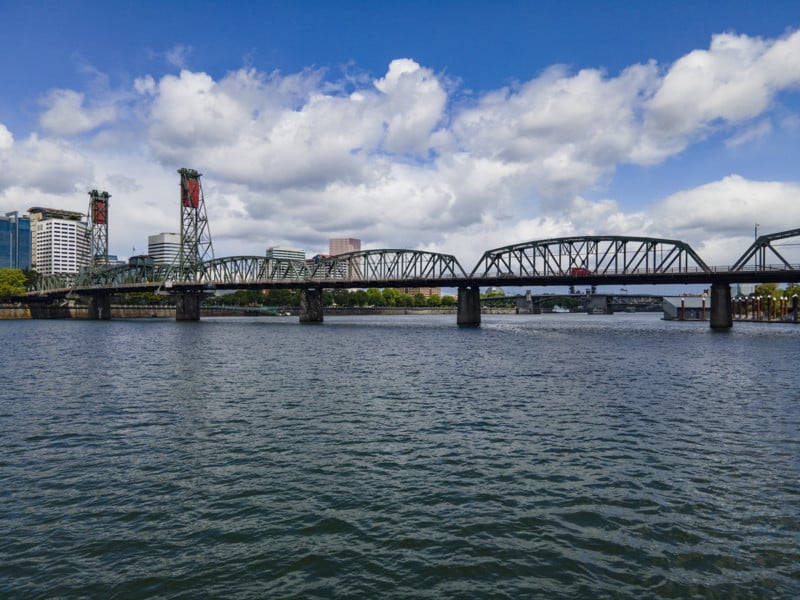
In the 12 megapixel photo, the blues seem to be on overdrive, while in the 48 megapixel still there is a bit more dynamism to the way the blues interact with subtle greens. This didn’t happen consistently, but I did want to report that it can occur.
Video Quality
When I reviewed the Mavic 2 Pro, I mentioned that I thought the photo-taking capabilities of that drone were better than what it could do in video, which was a first for any drone I had used. With the Air 2, DJI flips that back to what I am used to, with the video quality outperforming its still shooting capability.
That said, I highly recommend only shooting in the higher resolution modes with the Air 2, even if you don’t intend to use them at their full resolution. Why? Because the 1080p clips look horrible.
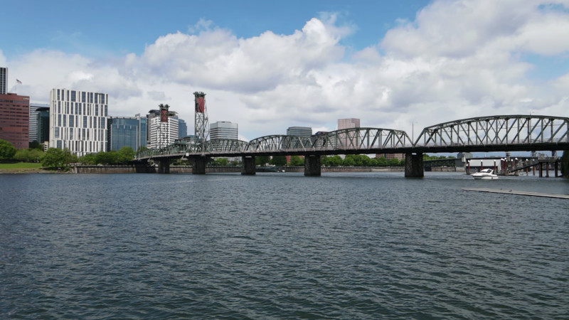
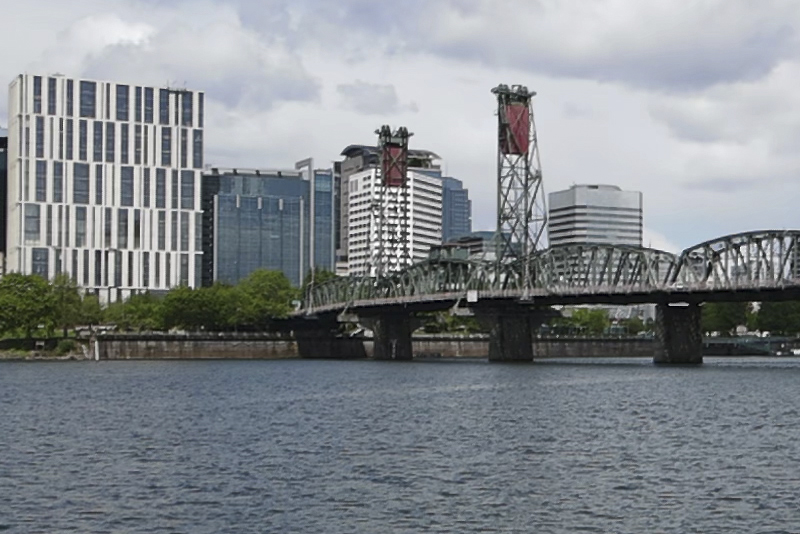
I don’t know specifically why the 1080p clips look so bad, but they’re markedly worse than the 4K regardless of the frame rate you choose. Whether it be an easy 24p or one of the two slow-motion modes, the finished quality crushes details and badly reproduces color. The way video looks reminds me of cheap DSLRs from 7 years ago. It’s really bad.
In 4K though, things look great. It’s by no means a low light camera as I hope I already made clear, but on bright sunny days, you’re going to get some really sharp, beautiful videos in brilliant 4K resolution. Even at 60 frames per second, the 4K is solid.
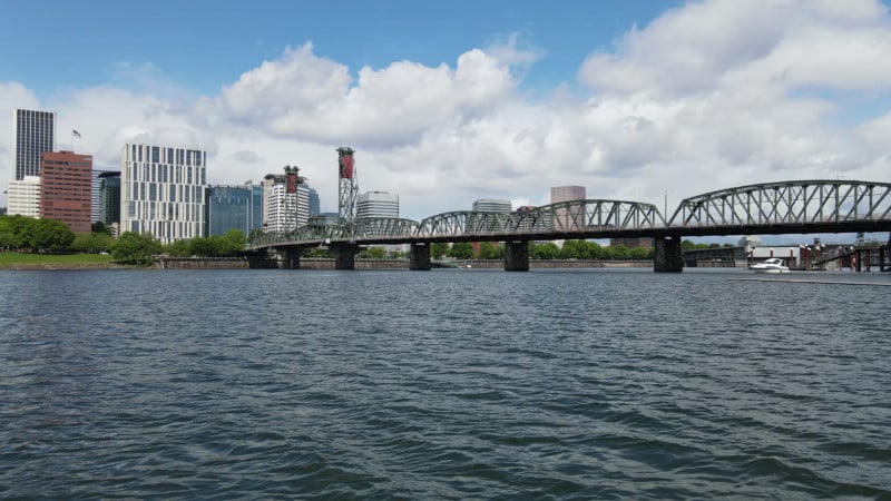
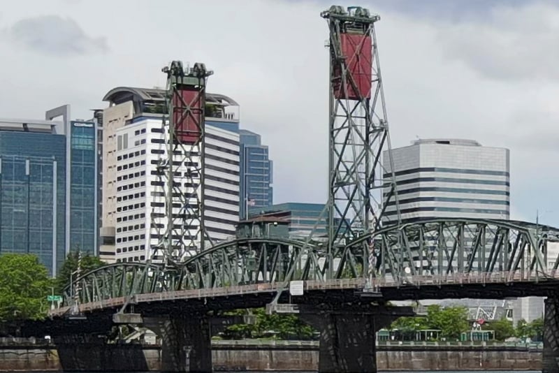
The Air 2 also has a 2.7K resolution mode that looks pretty much as good as 4K, so feel free to shoot there as well and not fear the crunchy quality you get with Full HD.
I will say this though: All the 4K modes look the same regardless of frame rate, and the same can be said of the Full HD video. For better or for worse, at least the drone is consistent.
I want to touch briefly on the Hyperlapse mode because it’s one of the coolest features of the Mavic 2 Pro and was bundled nicely into the Air 2.
If you didn’t notice, the Air 2 is significantly smaller than the Pro, and though that’s better for portability and accessibility for the average consumer, the motors are half the size of its bigger and more expensive brother. Doing hyperlapse moves is the only place I noticed this, but even slight breezes seemed to really give the Air 2 fits as it attempts to stay its course. I shot multiple hyperlapses as tests, and not a single one came out perfectly smooth; There was always some bump that wasn’t pretty.
Additionally, the Air 2 won’t store individual image files taken during a hyperlapse: your only option is to let the drone produce a finished video internally immediately after it finishes the hyperlapse move. At launch, the Air 2 can only export a Full HD video, and the quality is just as “meh” as with the standard video mode. I imagine once 8K hyperlapse functionality is added later this month, the quality will dramatically improve, but we’ll have to wait and see there.
It’s also a bummer that you don’t get to have the individual JPEGs or DNGs from the hyperlapse move to edit yourself as you do with the Pro. I understand leaving this out allows for a more solid line in the sand between models and the general consumer wasn’t going to go build their own hyperlapse in Lightroom/Premiere anyway, but it is still disappointing. DJI confirmed to me that the Air 2 will not save the individual photos in 8K mode either, so if you plan to use the Air 2 for hyperlapse, prepare to let it do all of the heavy lifting internally.
A Solid Consumer-Level Drone
The Mavic Air 2 was never designed to appeal to the same audiences as the Mavic 2 Pro, as you could probably guess by the major differences in price points. It’s a smaller, lighter, more hand-holding of a product that is absolutely a great purchase for the average drone enthusiast who just wants to have fun flying a camera. It’s not going to win any awards for image quality, and it’s ISO performance lags significantly behind the Mavic 2 Pro. You also don’t get an adjustable aperture, which is another disappointing feature left off the Air 2 from the Mavic 2 Pro. The Fly More bundle does come with three ND filters that are easy to swap on and off the drone, but I do miss having that control on the lens itself.
![]()
These differences are all by design. The high megapixel sensor is a really nice, flashy number that will appeal to the average shooter, and the 4K video along with the eventual 8K hyperlapse is going to be way more than enough for most of who this drone is targeted towards.
But if you’re a stickler for details and want this drone but with no compromises, then I would say save up the extra cash and pick up the Mavic 2 Pro. It’s still the best overall drone on the market in my opinion, and the Air 2 was designed to give you most of the wonderful features of that drone but in a more affordable package. That affordability comes with a few caveats, but if those don’t bother you then the Air 2 is a great little drone.

